Work — Website concepts

Concepts built to show what's possible.

Eight website concepts, each shown in full — desktop, responsive, and the thinking underneath. They exist to demonstrate how we handle design, structure and digital presentation when nothing is in the way.

Website concepts

Every project here is a concept. We wrote the brief, invented the business, and built the answer to the standard a commissioned project gets — nothing trimmed to a budget, nothing argued down in a meeting. A concept shows the direction. A real one is built around a business that exists, and goes considerably further.

Concept website

Amber & Oak

Fine dining

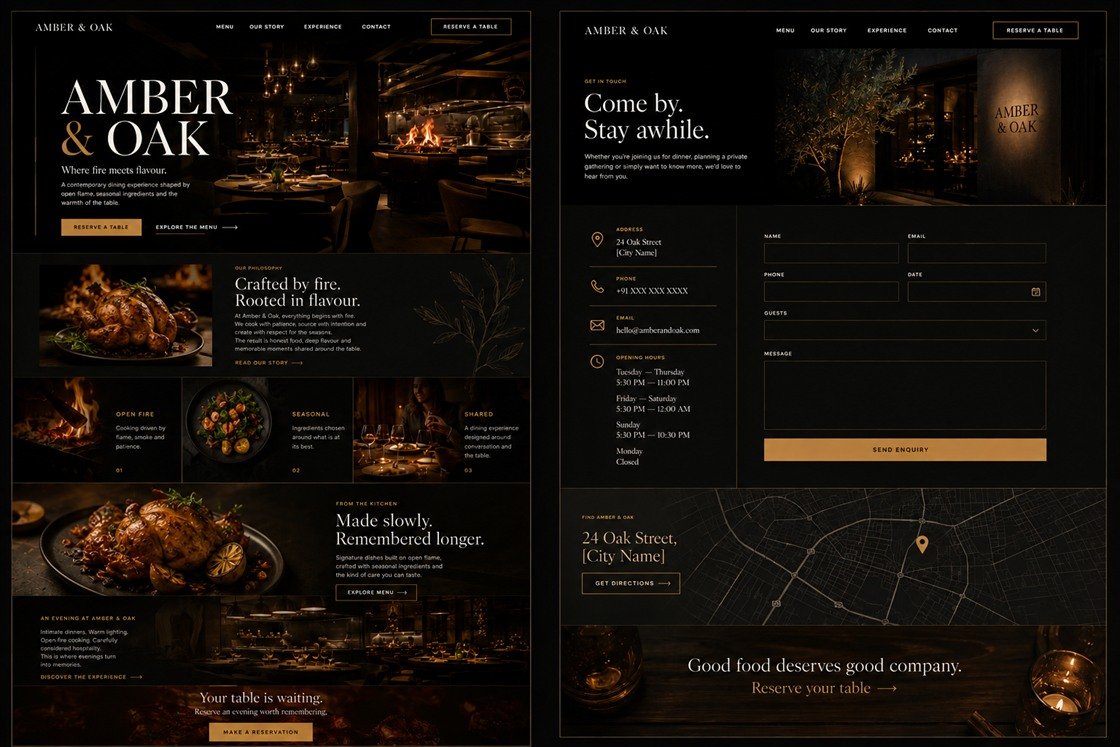
An intimate dining room where the reservation is never more than one tap away. Dark, photography-led, and built so the atmosphere does the persuading before the menu is ever opened.
Desktop preview
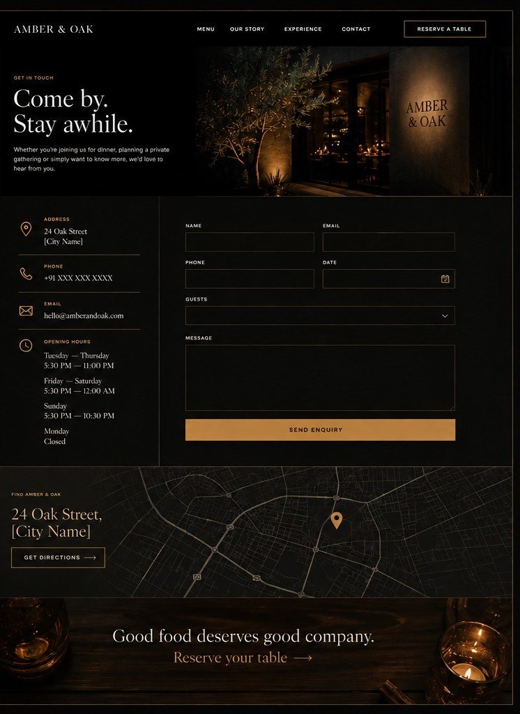
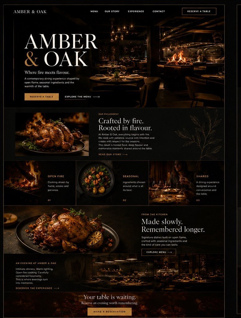
Amber and Oak, a fine-dining restaurant website design concept, on desktop: the home page and the contact page side by side, near-black with warm gold, an open-flame dining room in the hero and a reservation form on the contact page. Amber and Oak concept on desktop: the home page. Amber and Oak concept on desktop: the contact page.
Responsive preview — same site
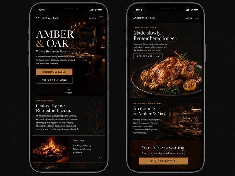
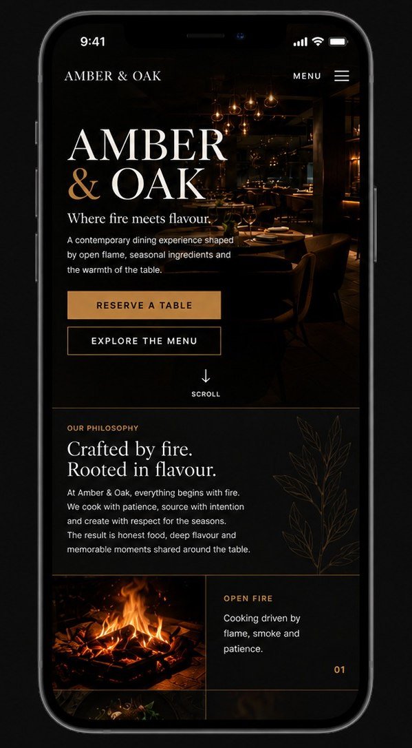
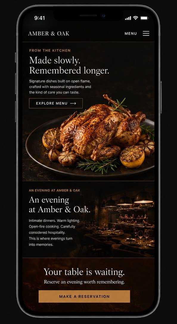
The same Amber and Oak concept on two phones: the home screen with its reservation buttons, and the menu and reservation sections further down the page. Amber and Oak concept on a phone: the home screen. Amber and Oak concept on a phone: the menu and reservation screen.
Design direction
Near-black ground with warm gold accents, food photography carrying every section.
Experience
Reserve a table is pinned to every screen; the menu is two clicks from anywhere on the site.
Visual identity
High-contrast serif lockup, wide letter-spacing, a palette held to three values.
Responsive approach
A separate phone layout rather than a narrowed desktop — the reservation repeats at the head and the foot of the page.

Design · Development · Brand system
Concept website

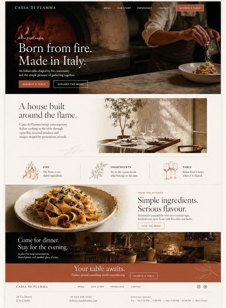
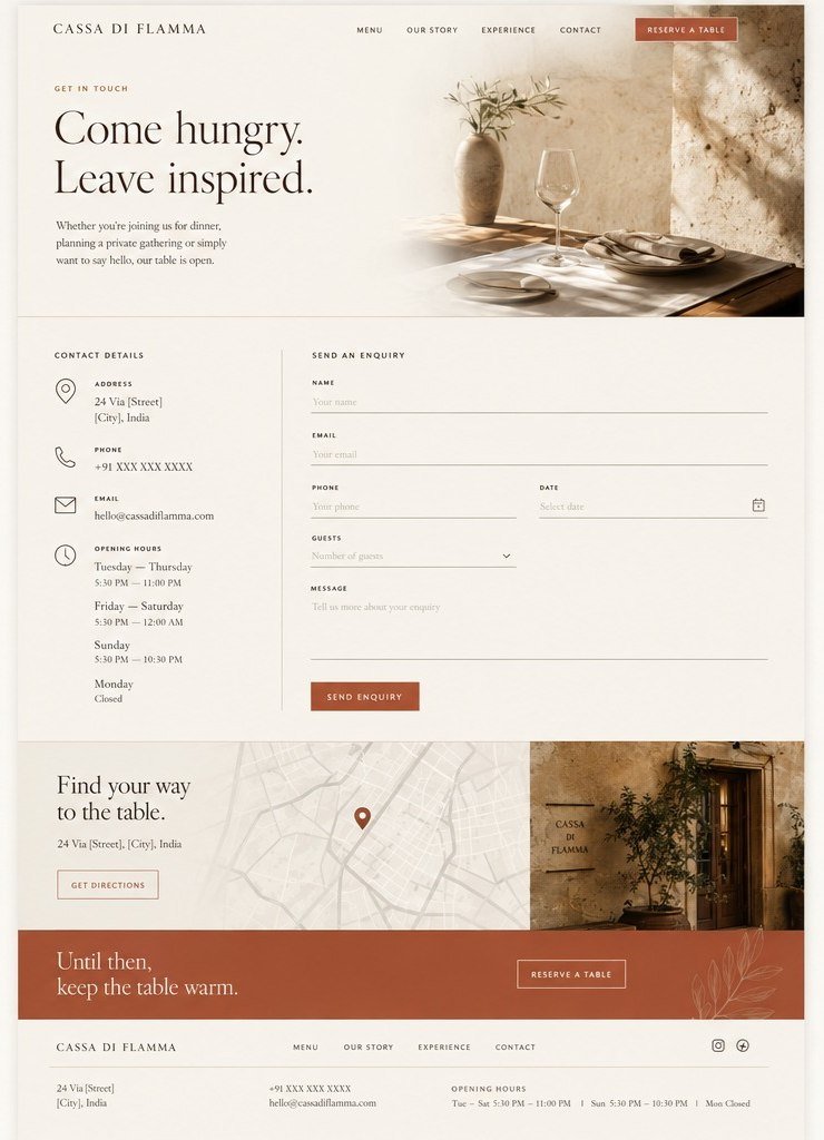
Cassa di Flamma

Cucina Italiana

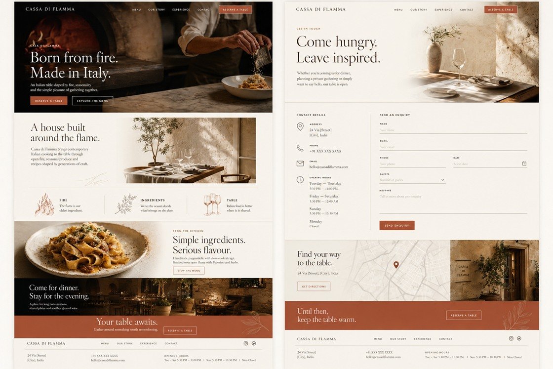
The same brief as Amber & Oak, argued in daylight. Warm paper, open space, and photography left to do the work — proof that the answer follows the business, not a house style.

Desktop preview
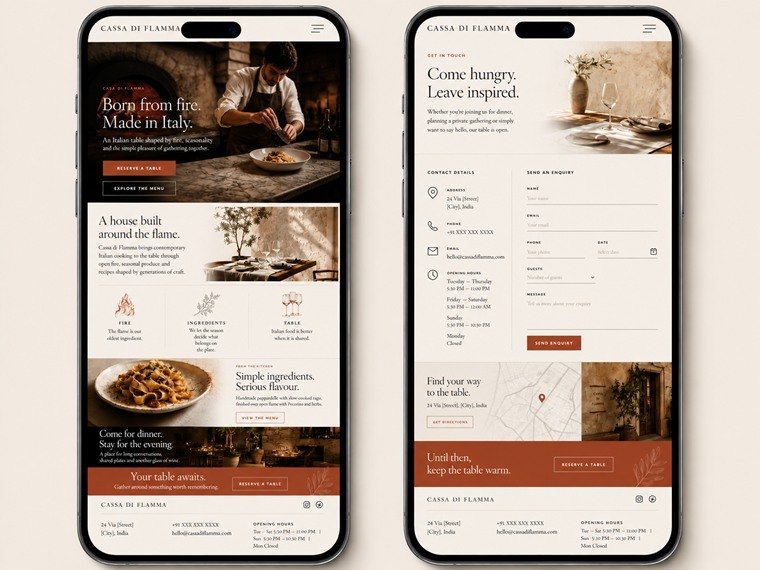
Cassa di Flamma, an Italian restaurant website design concept, on desktop: the home page and the contact page side by side on a warm cream ground, with a dark open-fire kitchen hero and a terracotta accent. Cassa di Flamma concept on desktop: the home page. Cassa di Flamma concept on desktop: the contact page.
Responsive preview — same site
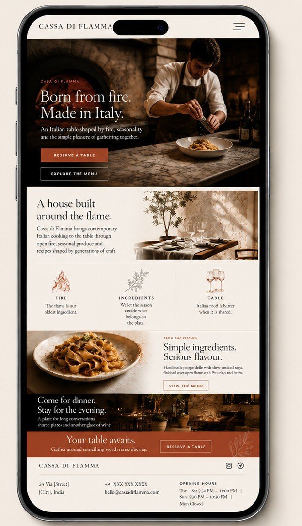
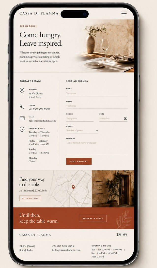
The same Cassa di Flamma concept on two phones: the home screen and the contact screen with its enquiry form. Cassa di Flamma concept on a phone: the home screen. Cassa di Flamma concept on a phone: the contact screen.
Design direction
Cream ground and wide margins — the opposite answer to the same problem.
Experience
Signature dishes surface early; reservation and general enquiry share one flow.
Visual identity
Classical serif on a modern grid, kept quiet so the photography leads.
Responsive approach
The three-part philosophy row keeps its columns rather than stacking; address, hours and contact sit in the footer of every screen.

Design · Development

Concept website

Sierra Hotel & Lodge

Hotel & lodge — Manali

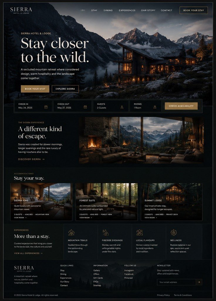
A Himalayan property where booking direct has to be a shorter, clearer path than any aggregator offers. The view is the product, so the interface gets out of its way.

Desktop preview
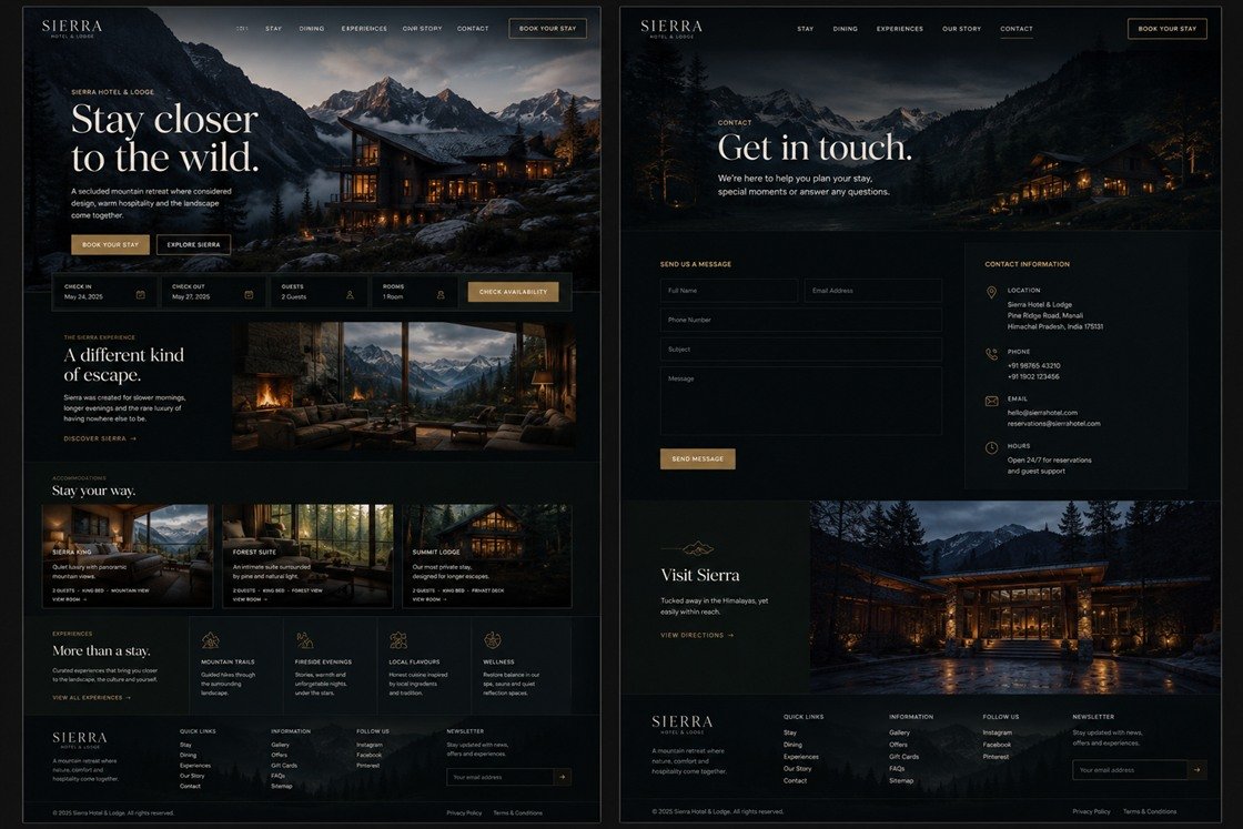
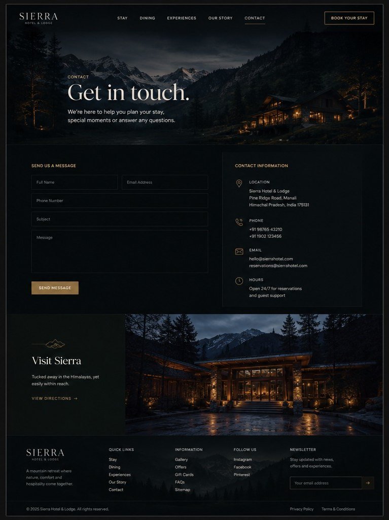
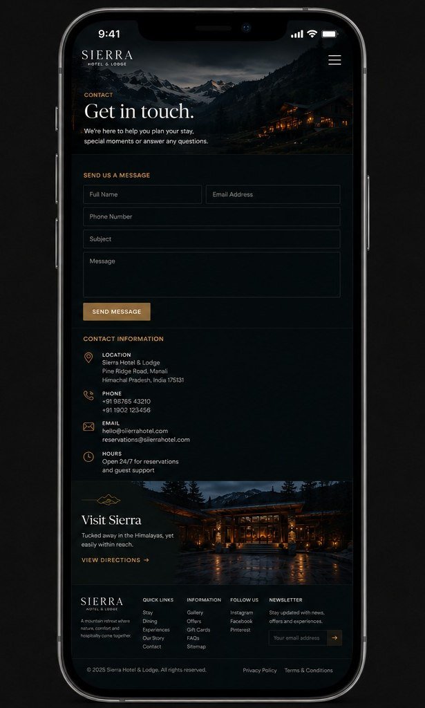
Sierra Hotel and Lodge, a hotel website design concept, on desktop: the home page with an availability bar under the hero, and the contact page, dark with a warm gold accent over mountain photography. Sierra Hotel and Lodge concept on desktop: the home page. Sierra Hotel and Lodge concept on desktop: the contact page.
Responsive preview — same site
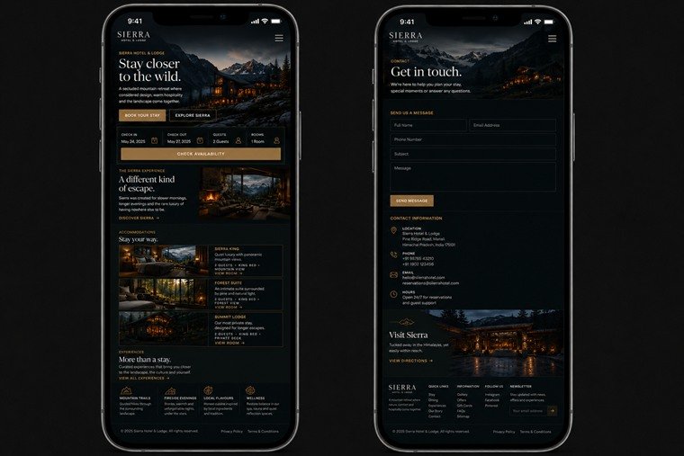
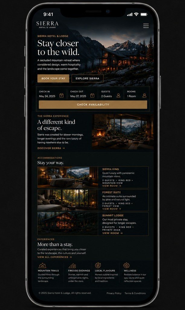
The same Sierra concept on two phones: the home screen with the availability bar and stacked room cards, and the contact screen. Sierra Hotel and Lodge concept on a phone: the home screen. Sierra Hotel and Lodge concept on a phone: the contact screen.
Design direction
Full-bleed landscape with minimal chrome laid over it; nothing competes with the view.
Experience
An availability bar sits directly under the hero; room types read at a glance by occupancy and outlook.
Visual identity
Quiet type, wide tracking, and a palette drawn from the photography rather than applied to it.
Responsive approach
The availability bar reflows to a full-width block; room cards stack with the photograph beside the detail.

Design · Development · Search

Concept website

Oakridge Elementary

Elementary school

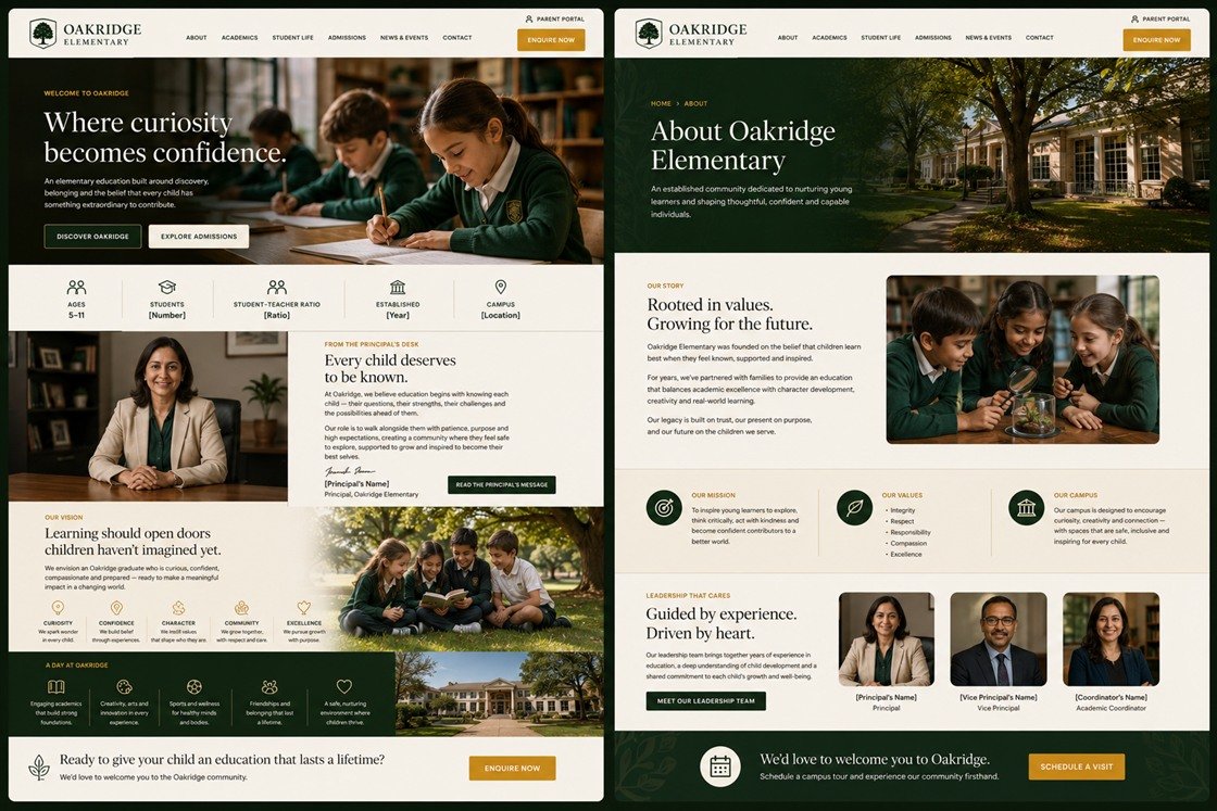
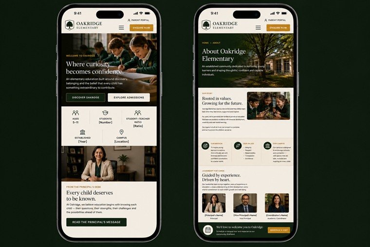
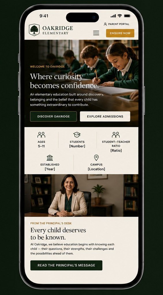
A school prospectus is read by parents, not by children. A stats band under the hero answers the first five questions before anyone scrolls — and its figures are left as bracketed placeholders, because a concept has no business inventing a student–teacher ratio.

Desktop preview
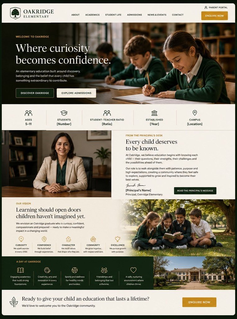
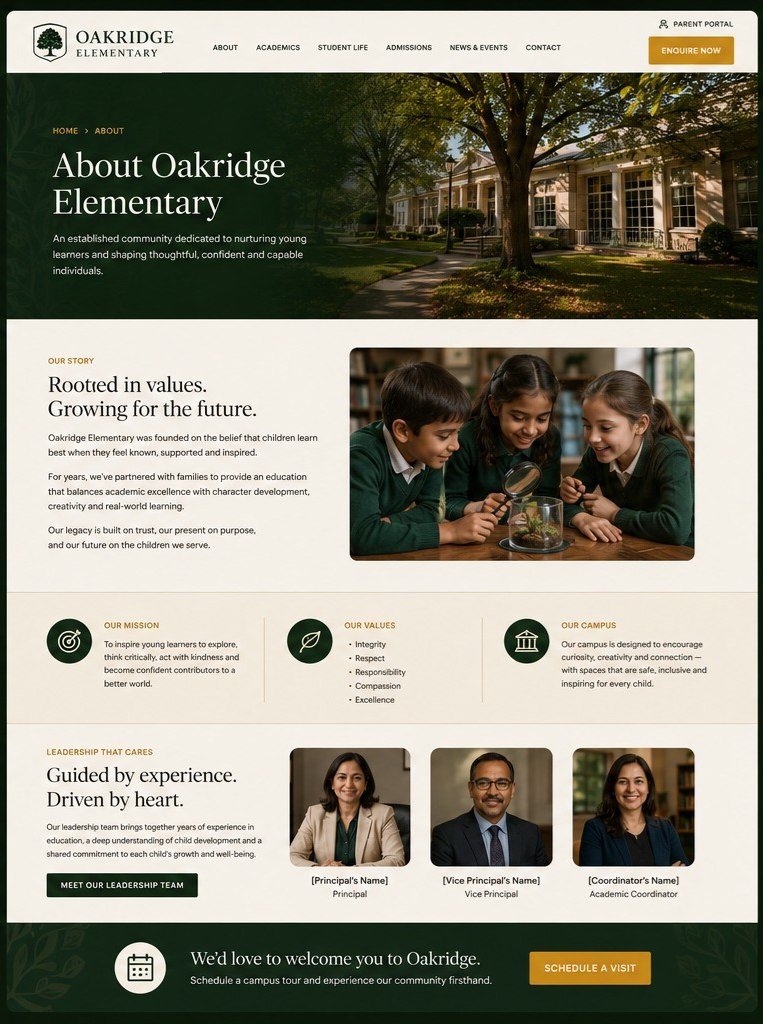
Oakridge Elementary, a school website design concept, on desktop: the home page with a stats band and the principal's message, and the about page with mission, values and leadership, in deep green and cream. Oakridge Elementary concept on desktop: the home page. Oakridge Elementary concept on desktop: the about page.
Responsive preview — same site
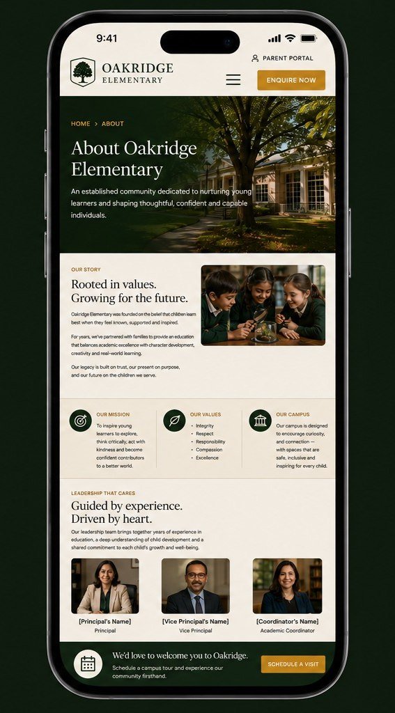
The same Oakridge concept on two phones: the home screen with the stats band reflowed, and the about screen. Oakridge Elementary concept on a phone: the home screen. Oakridge Elementary concept on a phone: the about screen.
Design direction
Deep green and cream with one gold accent, and photography given the room to carry the warmth.
Experience
Ages, ratio and campus answered before the first scroll; Enquire Now and the parent portal sit in the header of every page.
Visual identity
A crest lockup over serif display type — institutional without turning stiff.
Responsive approach
The five-column stats band reflows to three and two; the principal's portrait moves above her message rather than beside it.

Architecture · Design · Development

Concept website

Metalbreakers

Performance club

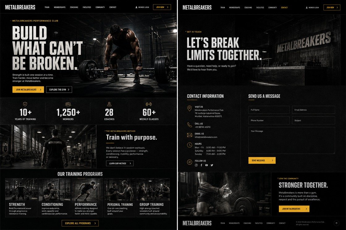
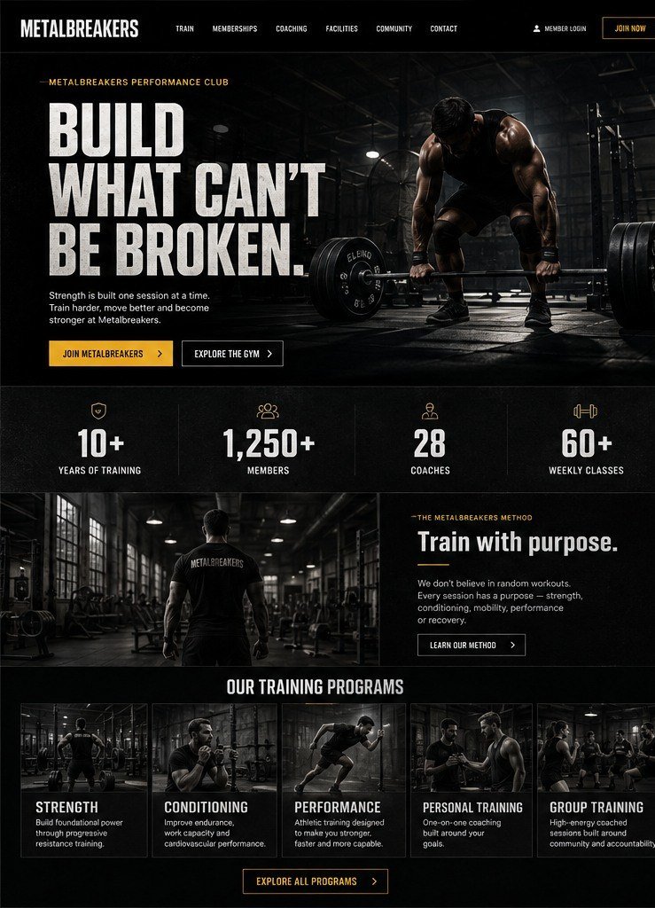
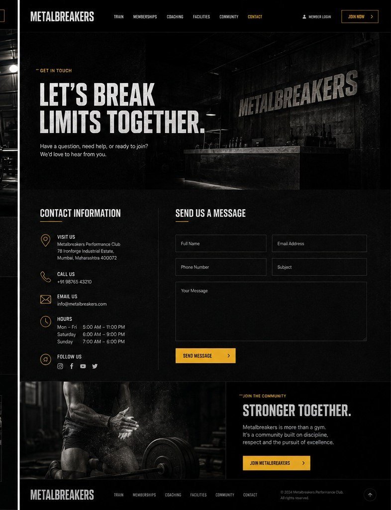
Near-black, heavy condensed type, and one instruction repeated the length of the page. Training is separated by what somebody wants to become rather than by tier, so the decision arrives before the price does.

Desktop preview
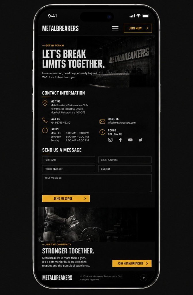
Metalbreakers, a fitness club website design concept, on desktop: the home page with a full-bleed training hero, a figures band and five programme cards, and the contact page, near-black with an amber accent. Metalbreakers concept on desktop: the home page. Metalbreakers concept on desktop: the contact page.
Responsive preview — same site
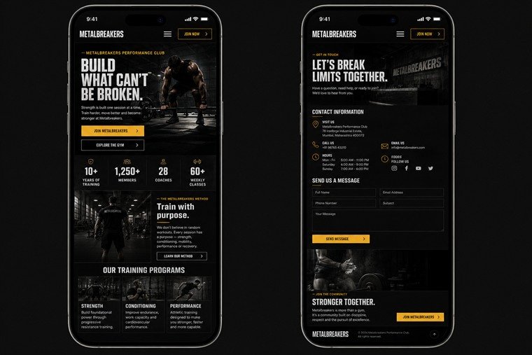
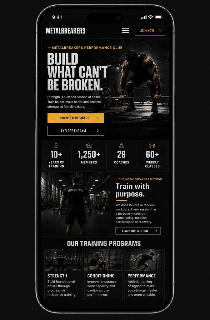
The same Metalbreakers concept on two phones: the home screen with the figures band intact, and the contact screen. Metalbreakers concept on a phone: the home screen. Metalbreakers concept on a phone: the contact screen.
Design direction
Near-black ground and a single amber accent, with photography shot dark so the type can carry the weight.
Experience
Join and Member Login hold the header on every page; five programmes are split by outcome, not by tier.
Visual identity
Condensed uppercase display and industrial spacing, with the wordmark stencilled onto the wall of the room itself.
Responsive approach
The figures band holds all four columns on a phone; programme cards drop from five across to three.

Design · Development · Brand system
Concept website

Ivory & Co. Dental

Dental clinic

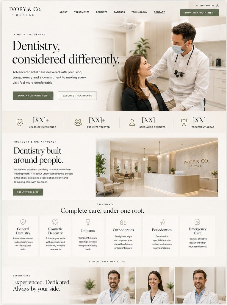
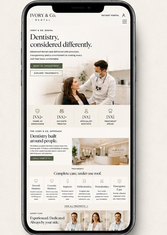
Healthcare has to reassure before it sells. Warm off-white and unhurried spacing, six treatment areas set out under one roof, and booking reachable from every screen without ever raising its voice.

Desktop preview
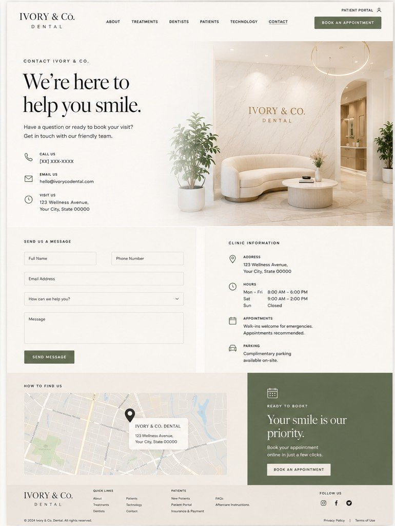
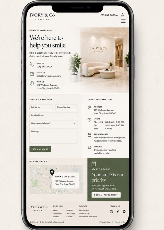
Ivory and Co. Dental, a dental clinic website design concept, on desktop: the home page with a figures band and six treatment areas, and the contact page with clinic details and a map, in warm off-white with a muted olive accent. Ivory and Co. Dental concept on desktop: the home page. Ivory and Co. Dental concept on desktop: the contact page.
Responsive preview — same site
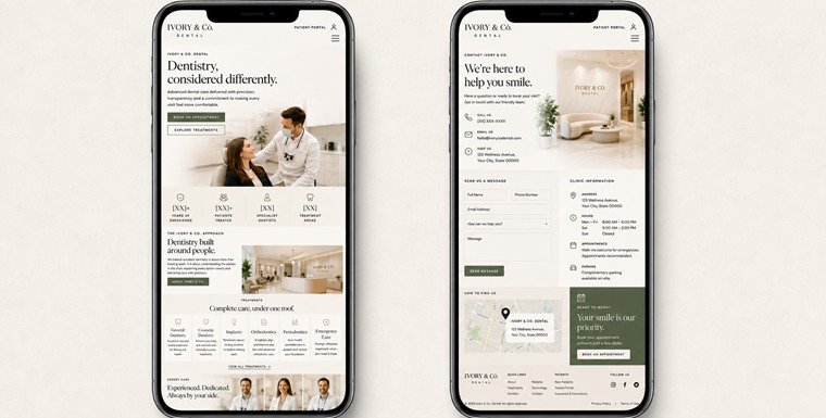
The same Ivory and Co. Dental concept on two phones: the home screen and the contact screen. Ivory and Co. Dental concept on a phone: the home screen. Ivory and Co. Dental concept on a phone: the contact screen.
Design direction
Warm off-white and a muted olive accent, with spacing used deliberately to lower the temperature.
Experience
Book an Appointment holds the header on both pages; each treatment area carries a plain-language line rather than a clinical one.
Visual identity
A high-contrast serif lockup over wide-tracked caps — closer to a hotel than a clinic, on purpose.
Responsive approach
The figures band and the six treatment cards both hold their rows on a phone; clinic details stack beneath the enquiry form.

Design · Development · Conversion

Concept website

Monarch Group

Diversified group

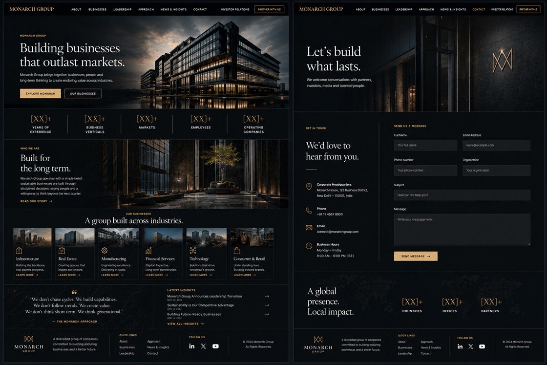
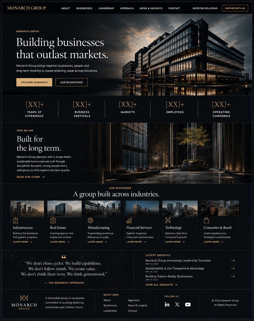
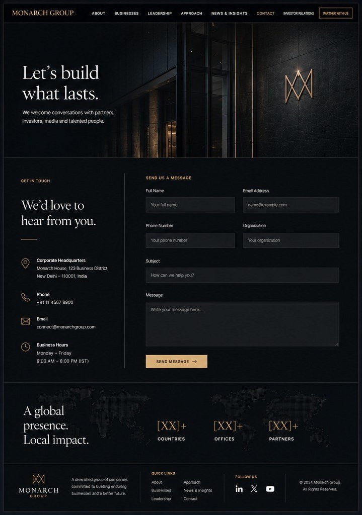
A holding group has to answer one question quickly: what do you actually own? Six verticals set out as a single row, a figures band that frames the scale before any of it is described, and investor relations kept deliberately apart from the marketing.

Desktop preview
Monarch Group, a corporate group website design concept, on desktop: the home page with a figures band and six industry verticals, and the contact page with a global presence band, in near-black with a gold accent. Monarch Group concept on desktop: the home page. Monarch Group concept on desktop: the contact page.
Responsive preview — same site
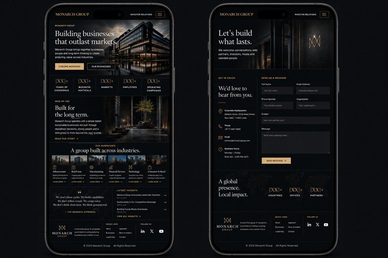
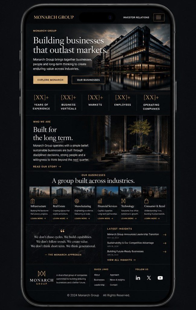
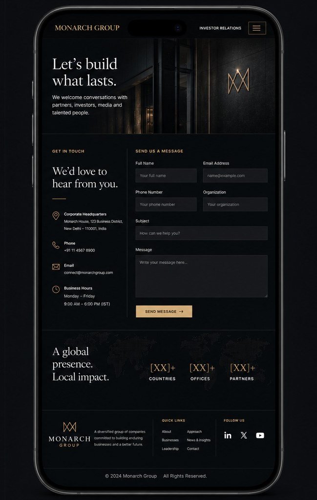
The same Monarch Group concept on two phones: the home screen with the verticals row intact, and the contact screen. Monarch Group concept on a phone: the home screen. Monarch Group concept on a phone: the contact screen.
Design direction
Near-black with a single gold rule and serif display type — corporate weight without the stock-photo gloss.
Experience
Investor Relations and Partner With Us sit outside the main nav; each of the six verticals opens its own path.
Visual identity
A monogram mark over wide-tracked caps, with the gold held to rules and accents rather than to fills.
Responsive approach
The five-figure band and the six vertical cards hold their rows on a phone; the approach quote stays beside the insights list.

Design · Development · Performance

Concept website

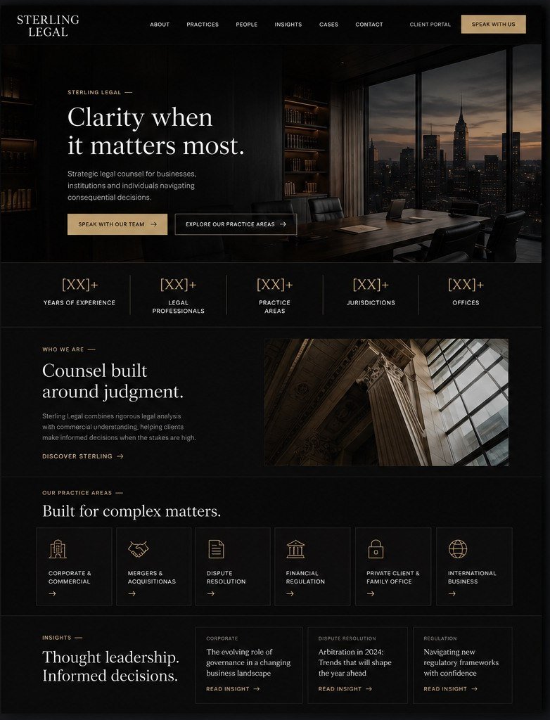
Sterling Legal

Law firm

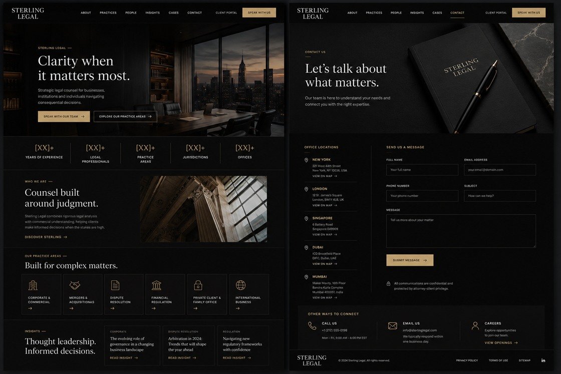
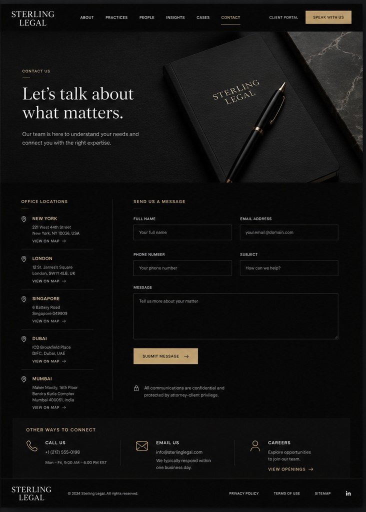
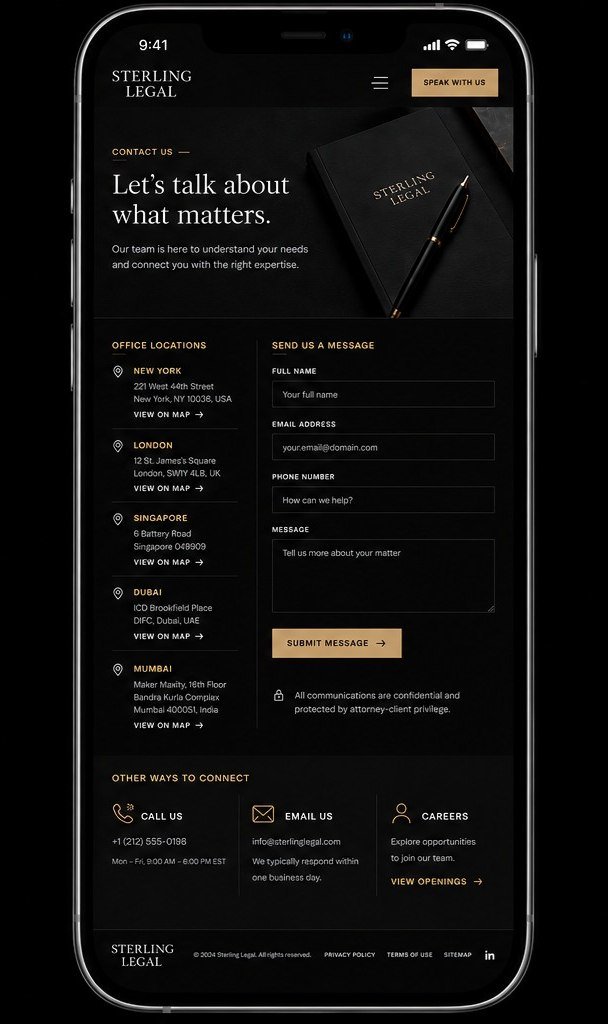
An established multi-jurisdiction firm, where the work is to look like the safe choice without ever claiming to be. Restraint does the persuading: five offices listed in full, six practice areas, and the privilege notice sitting under the contact form where a client would look for it.

Desktop preview
Sterling Legal, a law firm website design concept, on desktop: the home page with a figures band and six practice areas, and the contact page listing five office locations beside an enquiry form, in near-black with a brushed-gold accent. Sterling Legal concept on desktop: the home page. Sterling Legal concept on desktop: the contact page.
Responsive preview — same site
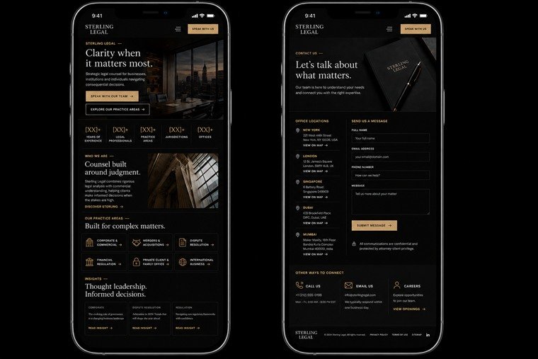
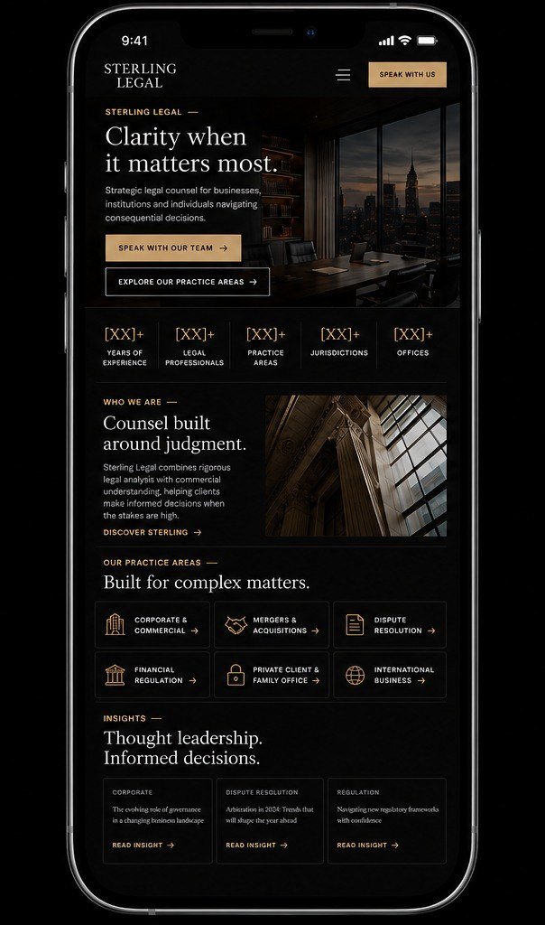
The same Sterling Legal concept on two phones: the home screen with the practice areas in three columns, and the contact screen with office locations above the form. Sterling Legal concept on a phone: the home screen. Sterling Legal concept on a phone: the contact screen.
Design direction
Near-black with a brushed-gold accent and a serif that reads as old rather than ornate.
Experience
Speak With Us and the client portal sit apart from the practice nav; five office addresses are given in full rather than hidden behind a map.
Visual identity
A stacked wordmark, hairline rules and wide-tracked labels — authority signalled by restraint, not ornament.
Responsive approach
The five-figure band holds its row; practice areas drop from six across to three, and office locations stack above the enquiry form.

Design · Development · Brand system
Questions

Why concepts,
and not client sites.

A fair question, and one worth answering properly — what is on this page is a deliberate decision about what a portfolio is actually for.

Select a question to expand

About the work shown here

One answer at a time.

  • Most of the work we create for clients is built specifically around their business, audience, goals and brand. Rather than turning those projects into generic portfolio pieces, we use concepts to show what Vyomatrics can create across different industries, styles and creative directions.

  • Some are concepts created specifically to demonstrate our capabilities and creative direction. They aren't presented as client work. We believe it is better to clearly show what we can build than to blur the line between concept work and commissioned projects.

  • Because a website built for one business isn't necessarily relevant to another. Our client projects are highly customised, and showing them as templates can give the wrong impression of what we would build for you. Concepts let us demonstrate our capabilities without putting another client's project into a one-size-fits-all portfolio.
  • No. The concepts on this page are simply a way of showcasing our creative and technical capabilities. Our client projects are built separately around their specific requirements, and our clients are happy with the work we have delivered.

  • Yes — but not by simply copying one of them. The point of these concepts is to show the level of design, creativity and execution we can bring to a project. Your website would be designed and built specifically around your business and what makes it different.

  • Yes. We don't believe in forcing businesses into pre-made templates. Your website is shaped around your brand, goals, audience, content and the experience you want your customers to have.

If something on this page is close to what you had in mind, the useful next step is telling us about your business rather than picking a concept.

Talk to us about yours

Next

A concept shows the
direction. Yours goes further.

These were built without a business behind them. Tell us what yours does, what you have now, and what needs to change.